I have been tasked with creating a captivating teaser clip to announce AkzoNobel's new purpose and showcase the evolution of their visual style in an inspiring and engaging way.
Additionally, fragments of the clip may serve as a dynamic backdrop for speakers or as a versatile animated key visual for high-level presentations.

Client: AkzoNobel
Agency: Design Bridge & Partners
Agency: Design Bridge & Partners
Approach
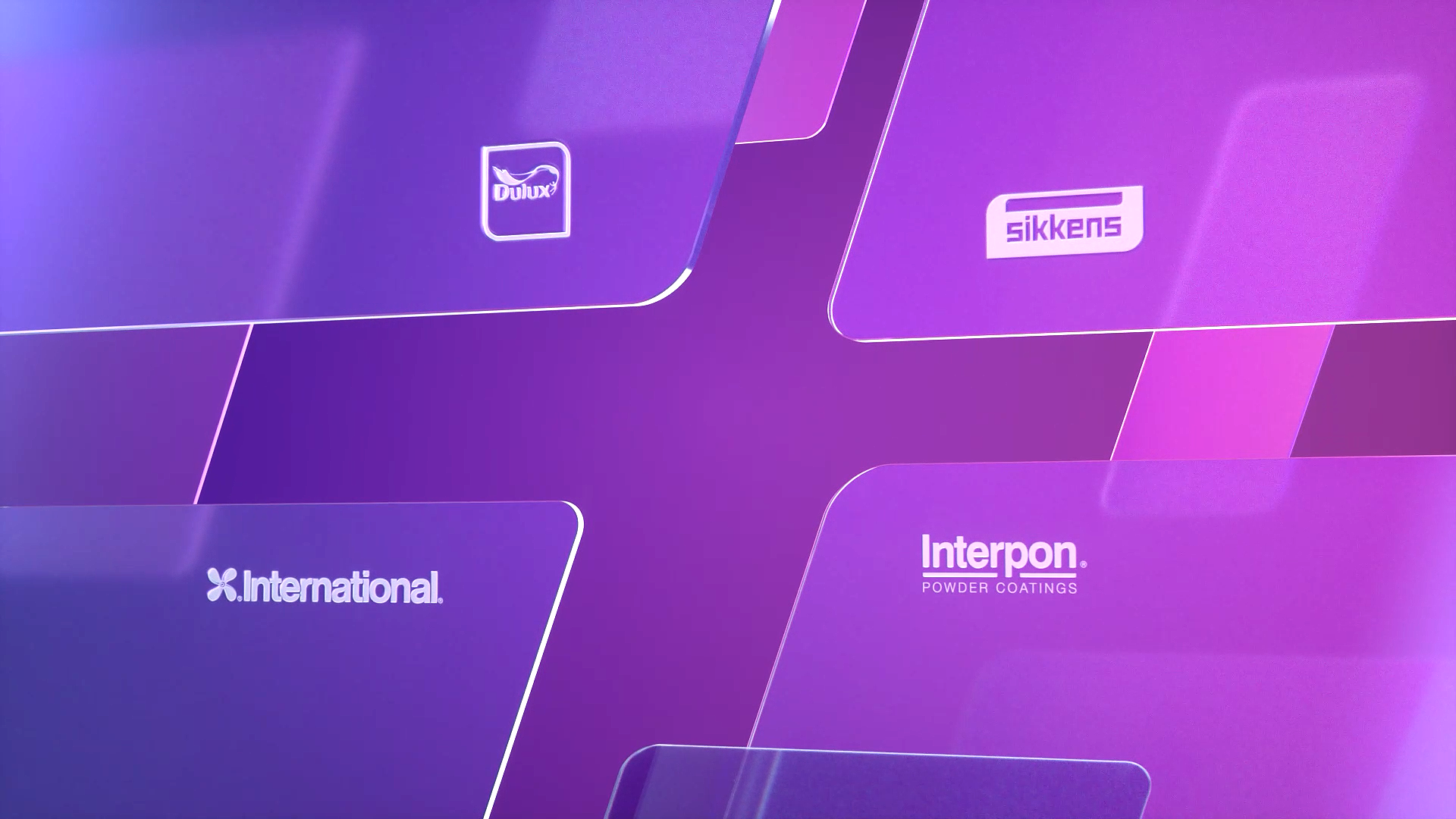
Our approach centered around creating a sense of depth and elegance using multiple layers of satin-finished glass rhomboids with softened edges.
Through gradients, light interplay, and overlapping elements, we aimed to introduce the new color palette in a visually compelling way.
Smooth, slow movements and a soft, diffused background enhance the overall sophistication, while copy fade-ins guide the viewer through the narrative.
Through gradients, light interplay, and overlapping elements, we aimed to introduce the new color palette in a visually compelling way.
Smooth, slow movements and a soft, diffused background enhance the overall sophistication, while copy fade-ins guide the viewer through the narrative.
Outcome
The result is a refined animation that gradually evolves from a pink to blue color scheme, symbolizing transformation and innovation. The interplay of layered glass effects and light enhances the premium feel, while the slow, fluid movements maintain a balanced and immersive composition.
In the final sequence, the various elements come together to form the AkzoNobel logo, effectively introducing the brand’s new visual identity.